
Touch target size and gestures for Android
A fingertip is not a mouse pointer. It is wide, soft, hides what it touches, and on the move it lands a few millimetres away from where you aimed. Getting touch target size and gestures right is what separates an app people can use while walking from one they have to stop and squint at.
Key takeaways
- Make every touch target at least 48×48dp, with about 8dp between neighbours. Bigger for the main action.
- The visible icon can be small; the tappable area should not be.
- Use tap for the common action, swipe for its opposite, long-press for more options, double-tap for quick toggles.
- Every gesture needs a visible alternative, because gestures are invisible until someone discovers them.
- Prefer Undo to "Are you sure?" so the flow stays fast and mistakes stay cheap.
How big should touch targets be?
Android's Material Design guidance sets a minimum touch target of 48×48dp. On a typical phone that works out to roughly 9mm square, about the size of an average adult finger pad. Accessibility standards set related floors for the web, which are a useful cross-check:
Treat 48dp as the floor, not the goal. The action someone repeats fifty times in a session, such as counting stock or ticking off a checklist, deserves a target two or three times larger. Bigger targets are faster to hit (that is Fitts's law in practice) and they forgive the shaky, glove-wearing, walking-pace taps that happen in the real world.
Visual size is not touch size
A 24dp icon can have a 48dp touch area. In Jetpack Compose, Material components such as IconButton, Checkbox and Switch already pad themselves to the minimum interactive size. When you build your own clickable element, add Modifier.minimumInteractiveComponentSize() or give it an explicit size.
Box(
    modifier = Modifier
        .minimumInteractiveComponentSize()
        .clickable(onClickLabel = "Flag item") { onFlag() },
    contentAlignment = Alignment.Center
) {
    Icon(Icons.Outlined.Flag, contentDescription = null, modifier = Modifier.size(20.dp))
}
Remember that the touch area is invisible. If two padded targets overlap, the one drawn last wins and the user gets the wrong action. Keep at least 8dp of real space between them.
Make the whole row or card the target for its main action. A list row where only the tiny chevron is tappable wastes most of the screen.
The fat-finger problem, and how to design around it
Most mis-taps come from three situations: targets that are too small, targets that are too close together, and targets right at the edge of the screen where the palm or the phone case gets in the way. The fixes are equally simple.
Do
- Separate opposite actions (add / remove, accept / reject) by space or by position.
- Keep a margin of at least 16dp from screen edges for small targets.
- Give destructive actions their own row, away from frequent ones.
Avoid
- Rows of small icons packed into a toolbar.
- Text links inside paragraphs as the only way to act.
- "Delete" placed directly next to "Edit".
Choosing the right gesture for each action
Gestures let a small screen do more without adding buttons, but each gesture carries an expectation. Match the gesture to what people already assume it means on Android.
| Gesture | Best for | Watch out for |
|---|---|---|
| Tap | The primary, most common action | Make it obvious what is tappable |
| Swipe horizontally | Opposite or dismissive actions: remove, archive, decrement, switch page | Conflicts with system back gestures near the screen edge |
| Long-press | Extra options, details, selection mode | Nobody discovers it without a hint |
| Double-tap | Quick toggles: favourite, flag, zoom | Delays single-tap handling on the same element |
| Drag | Reordering, sliders, moving between zones | Fights with scrolling in the same direction |
Tap, double-tap and long-press on one element
In Compose, combinedClickable handles all three on the same card. Always add onClickLabel and onLongClickLabel so screen readers announce what each does.
Card(
    modifier = Modifier.combinedClickable(
        onClickLabel = "Add one",
        onClick = { onAdd(item) },
        onDoubleClick = { onToggleFlag(item) },
        onLongClickLabel = "Show details",
        onLongClick = { onOpenDetails(item) }
    )
) {
    ItemSummary(item)
}
Swipe to remove
Material 3's SwipeToDismissBox gives you a swipe with a background revealing what will happen. Show the consequence (an icon and a colour) as the finger moves, so the gesture explains itself.
val dismissState = rememberSwipeToDismissBoxState()
LaunchedEffect(dismissState.currentValue) {
    if (dismissState.currentValue == SwipeToDismissBoxValue.EndToStart) onRemove(item)
}
SwipeToDismissBox(
    state = dismissState,
    enableDismissFromStartToEnd = false,
    backgroundContent = { RemoveBackground() }
) {
    ItemRow(item)
}
Make gestures discoverable and never the only way
Gestures are invisible. A new user cannot see that a card responds to a long-press, and some users cannot perform certain gestures at all, for example with a motor impairment or while wearing gloves. Two rules keep gestures fair:
- Every gesture has a visible alternative: a button, a menu entry or an item in the bottom sheet.
- Hint once, in context: a short first-run tip, a partly peeking sheet, or a card that nudges sideways the first time.
- Expose custom actions to TalkBack with
semantics { customActions = … }so swipe-only actions are reachable without swiping. - Keep horizontal swipes away from the outer edges, where Android's back gesture lives.
Bottom sheets for "more options"
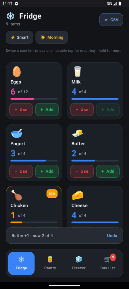
When a long-press reveals more options, show them in a ModalBottomSheet. It rises from where the thumb already is, has room for bigger controls than the card itself, and closes with a swipe down or the back gesture. In the Thumb Inventory example, holding an item opens a sheet with large stock-level buttons and a stepper, which is much easier to use than squeezing those controls into the card.
if (detailItem != null) {
    ModalBottomSheet(onDismissRequest = { detailItem = null }) {
        ItemDetailControls(item = detailItem!!, onSetLevel = onSetLevel)
    }
}
Undo instead of "Are you sure?"
Confirmation dialogs feel safe, but they interrupt every action to protect against the rare mistake, and people quickly learn to tap "OK" without reading. On a phone they are worse still: a dialog appears in the middle of the screen, the button is in the stretch zone, and the task stalls.
Instead, apply the change immediately and offer a short-lived Undo. The common case is fast, and the rare mistake is one tap away from being fixed.
scope.launch {
    val result = snackbarHostState.showSnackbar(
        message = "Milk −1 · now 3",
        actionLabel = "Undo",
        duration = SnackbarDuration.Short
    )
    if (result == SnackbarResult.ActionPerformed) onUndo()
}
Keep confirmations for actions that truly cannot be undone, such as permanently wiping data or sending something to another person. See haptics and feedback for how to pair Undo with a vibration so users know the action landed without looking.
Try it on a real device
Touch targets and gestures only make sense under a real thumb. Set up a project with the quick start, then use live reload to tweak sizes and gestures and feel the difference on your phone within seconds. The thumb zone guide covers where those targets should sit.
Frequently asked questions
What is the minimum touch target size on Android?
Material Design recommends at least 48×48dp for every touch target, with about 8dp of space between separate targets. The visible icon can be smaller as long as the tappable area meets that size.
What does WCAG 2.2 say about touch target size?
WCAG 2.2 Success Criterion 2.5.8 (level AA) requires targets of at least 24×24 CSS pixels or enough spacing around smaller ones, and 2.5.5 (level AAA) asks for 44×44 CSS pixels. Android's 48dp guidance comfortably meets both.
Should I use a confirmation dialog or Undo?
Use Undo for most actions: apply the change straight away and show a short notice with an Undo button. Keep confirmation dialogs for the few actions that cannot be reversed, such as permanently deleting data.
How do I handle long-press and double-tap in Jetpack Compose?
Use Modifier.combinedClickable with onClick, onDoubleClick and onLongClick on the same element, and set onClickLabel and onLongClickLabel so accessibility services can describe each action.