
The thumb zone: designing for one-handed phone use
Most people hold a phone in one hand and tap with the thumb of that same hand. The thumb sweeps an arc, not a rectangle, so some parts of the screen are effortless to reach and others need a grip change. Designing around that arc is the single biggest usability win on a small screen.
Key takeaways
- The thumb zone is the lower-middle of the screen: put the most frequent actions there.
- The top corners are the hardest to reach one-handed. Keep them for rare or destructive actions.
- Use bottom navigation, bottom sheets and bottom-anchored primary buttons instead of top toolbars full of actions.
- Design for both hands: keep key actions centred, or mirror-safe, rather than hugging one edge.
- Test on the largest phone you can find, holding it in one hand while standing.
What is the thumb zone?
The thumb zone is the area of a phone screen you can reach comfortably with the thumb of the hand holding the device. The idea comes from field observation of how people actually hold phones. In his 2013 study, Steven Hoober watched over 1,300 people using phones in public and found that about half (roughly 49%) were holding and tapping with one hand. Others cradled the phone in one hand and tapped with the other, or used two thumbs. Grips change all the time, often several times a minute.
For one-handed use, the thumb pivots from the base of the hand, near the bottom corner of the phone. That pivot point is what shapes the thumb reach map: an arc of easy reach across the lower and middle screen, a band of stretch around it, and hard-to-reach areas in the opposite top corner and right along the bottom edge under the palm.
Why the thumb zone matters more on large phones
Phones have grown taller while hands have not. On a compact phone, a thumb could reach almost everything. On a modern 6.5-inch device, the top third of the screen is out of reach for most one-handed grips, which forces people to shuffle the phone in their hand, bring in the second hand, or give up and put down what they were holding.
That matters most when the user has something else going on: carrying a box, holding a railing on a ladder, pushing a trolley, or holding a clipboard. These are exactly the situations where small field apps are used. If the main action needs two hands, the app quietly fails the person using it.
Every grip change is a chance to drop the phone. On a ladder, in a cold store or on a moving vehicle, that is a safety problem, not just an annoyance.
Map each action to a zone by how often it is used
Start with a list of everything the screen lets people do, then rank the actions by frequency. The ranking tells you where each control should live.
| Zone | What goes there | Examples |
|---|---|---|
| Easy (lower-middle) | The one or two actions people do dozens of times per session | Add, use, next, scan, mark done, primary button |
| Stretch (middle and lower edges) | Content people read and occasionally tap | List items, cards, secondary buttons, tabs |
| Hard (top, especially the far corner) | Rare, global or destructive actions | Settings, delete, export, account, help |
Putting destructive actions in the hard zone is a feature: an accidental tap on "Delete all" is far less likely when it sits where the thumb never rests.
Patterns that keep actions within thumb reach
Bottom navigation instead of top tabs
A bottom navigation bar with three to five destinations puts switching between sections right under the thumb. Top tabs look tidy in a mock-up, but they sit in the stretch-to-hard zone on a tall phone. If you have more than five destinations, that is usually a sign the app should be split into simpler screens.
Bottom sheets for choices and details
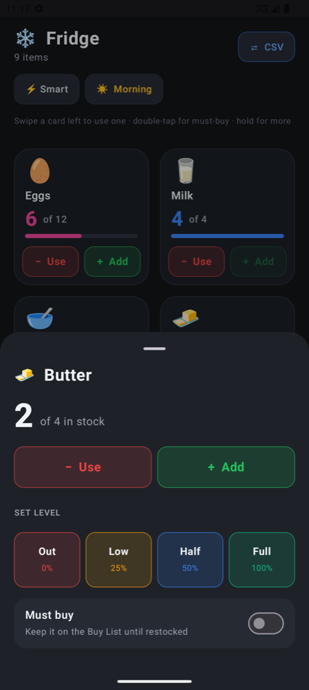
A bottom sheet slides up from the edge the thumb already rests on, and its options appear where they are easy to tap. Use bottom sheets for menus, item details, filters and confirmation of bulk actions, rather than dialogs centred on the screen or menus dropping down from the top toolbar.
Bottom-anchored primary buttons
For forms and step-by-step flows, keep the main button pinned to the bottom of the screen, full width or centred, so "Save" or "Next" is always in the same easy spot regardless of how far the content scrolls.
Pull content down, not the thumb up
When content must sit at the top, such as a search field, consider letting it move: a search bar at the bottom of the screen, a list that starts lower, or a header that collapses on scroll so the content scrolls into reach.
Scaffold(
    bottomBar = {
        NavigationBar {
            zones.forEach { zone ->
                NavigationBarItem(
                    selected = zone == currentZone,
                    onClick = { currentZone = zone },
                    icon = { Text(zone.icon) },
                    label = { Text(zone.label) }
                )
            }
        }
    }
) { innerPadding ->
    InventoryGrid(modifier = Modifier.padding(innerPadding))
}
Left-handed, right-handed and switching hands
A thumb reach map is drawn for one hand, but your users do not all use the same one, and many switch during the day. A layout that only works for right thumbs is a layout that fails roughly one person in ten all the time and everyone else whenever their right hand is busy.
Do
- Centre the primary action horizontally, or make it full width.
- Make the whole card or row tappable, not a small icon on one side.
- Keep swipe gestures symmetric: left and right both work, with clear meanings.
Avoid
- Floating action buttons tight in the bottom-right corner as the only way to do the main task.
- Important controls in the top-left, the hardest point for a right thumb.
- Small targets close to the screen edge, where the palm rests and causes accidental taps.
The thumb zone in practice: Thumb Inventory
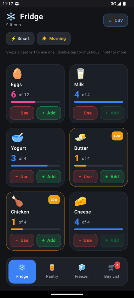
The Thumb Inventory example app is built around one-handed use at a shelf. Each item card carries large Use and Add buttons, the zone tabs (Fridge, Pantry, Freezer and Buy List) live at the bottom of the screen, and swiping left or right on the zone bar switches zones without reaching up. Sorting and the share-and-sync menu sit in the header, in the hard zone, because nobody needs them mid-count.
How to test one-handed use
Thumb zone diagrams are a starting point. The real test is a person, a phone and a task.
- Use the biggest phone you can borrow. If it works one-handed on a large device, it works on a small one.
- Stand up and hold something in your other hand, a cup or a box, so you cannot cheat with a second thumb.
- Run the core task ten times in a row. Count how often you changed grip or stretched.
- Swap hands and repeat. Anything that only works for one hand needs a rethink.
- Watch someone else do it without explaining the screen. Where they reach first is where the action should be.
With live reload you can move a button, save, and try again on a real phone within seconds, which makes this kind of testing quick enough to do on every change. If you have not set up a project yet, the quick start takes a few minutes.
Frequently asked questions
What is the thumb zone in mobile design?
The thumb zone is the part of a phone screen that can be reached comfortably with the thumb of the hand holding the phone. It is roughly the lower-middle of the screen; the top, and especially the far top corner, is the hardest to reach.
Where should the main button go on a phone screen?
Put the most frequent action in the lower-middle of the screen, ideally centred or full width so it works for both left and right thumbs. Rare and destructive actions belong further away, near the top.
Is bottom navigation better than top tabs on Android?
For one-handed use on tall phones, yes. A bottom navigation bar with three to five destinations keeps switching sections inside the thumb zone, while top tabs sit in the hardest-to-reach area of the screen.
How many people use their phone with one hand?
In Steven Hoober's 2013 observational study of over 1,300 people, about 49% were using their phone one-handed at the moment they were observed. Grips change often, so design for one hand and let two hands be a bonus.