
Readable text on small screens: font size, contrast, sunlight and dark mode
A phone app is read at arm's length, in bright sun, in a dim stockroom, through scratched glass and by people who have turned their font size up. Readable mobile typography is less about picking a pretty font and more about size, contrast, hierarchy and letting the system scale your text.
Key takeaways
- Use
spfor text so it follows the user's font size setting, and test at 200%. - Body text around 16sp, key numbers much larger. Make the one thing people glance at the biggest thing on the screen.
- Meet contrast of at least 4.5:1 for body text and 3:1 for large text and UI components.
- Design for sunlight: strong contrast, heavier weights, no thin grey text.
- Support dark mode properly, with tuned colours rather than an inverted palette.
Design for a glance, not a read
People rarely read a phone screen top to bottom while working. They glance: for one or two seconds, often while doing something else. A glanceable UI answers the user's main question in that glance.
- Decide what the single most important value on each screen is: a count, a status, a next step.
- Make it the largest, boldest element on the screen.
- Put labels and secondary details in smaller, quieter text around it.
- Cut anything that does not help the glance. Small screens punish clutter.
In the Thumb Inventory example, each item card shows the count in large bold digits with a coloured stock bar underneath, so you can scan a shelf's worth of items without reading a single label.
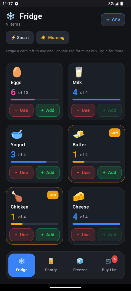
Mobile font sizes and sp units
On Android, define text sizes in sp (scale-independent pixels) and layout sizes in dp. Both adapt to screen density, but sp also follows the user's font size setting. Using dp for text silently ignores that setting, which is exactly the opposite of what people who enlarged their text need.
| Role | Typical size | Notes |
|---|---|---|
| Key value (count, total, status) | 28–40sp, bold | The one thing people glance at |
| Screen title | 22–24sp | Keep it short so it fits on one line |
| Body and list items | 16sp | Never smaller for anything people must read |
| Secondary labels | 14sp | Supporting details only |
| Captions and badges | 12sp minimum | Short words; never critical information |
Start from the Material 3 type scale in MaterialTheme.typography instead of hard-coding sizes everywhere. One change to the theme then updates the whole app consistently.
Text(
    text = item.quantity.toString(),
    style = MaterialTheme.typography.displaySmall,
    fontWeight = FontWeight.Bold
)
Text(
    text = item.name,
    style = MaterialTheme.typography.bodyLarge,
    maxLines = 2,
    overflow = TextOverflow.Ellipsis
)
Support Android font scaling up to 200%
Many people raise the system font size, and not only older users: anyone in a moving vehicle or working without their glasses benefits. Since Android 14, users can scale fonts up to 200%, and Android applies nonlinear scaling so that already-large text grows less than small text.
Layouts that look perfect at 100% often break at 200%. Common failures and fixes:
Do
- Let containers grow with their text: use
heightIn(min = …)rather than fixed heights. - Allow labels to wrap to two lines, then ellipsise.
- Switch rows to columns when the text no longer fits side by side.
- Preview with
@Preview(fontScale = 2f)and test on a device set to the largest size.
Avoid
- Fixed-height buttons and cards that clip enlarged text.
- Text sized in
dpto "protect" a layout. - Truncating the important word, such as an item name, to one line.
Contrast ratios that pass accessibility and real life
The Web Content Accessibility Guidelines set the contrast floors that most design systems, including Material, build on:
Treat those numbers as the minimum for a screen in a comfortable office. Field devices are used in conditions that steal contrast: glare, dirty screens, low brightness to save battery, and tinted glasses. Aim higher for anything people need to read in a hurry.
Light grey placeholder text, thin font weights and coloured text on coloured backgrounds are the first things to disappear in sunlight. If text matters, make it dark-on-light or light-on-dark at full strength.
Readable in sunlight and in the dark
Outdoors and in bright light
- Use medium or bold weights for important text; thin strokes vanish in glare.
- Prefer strong, simple colour coding (green, amber, red) backed by text or icons.
- Avoid large areas of mid-grey; they wash out to nothing.
- Do not override the system brightness. Let auto-brightness do its job.
Indoors, in dim stockrooms and at night
- Offer a dark theme so the screen does not dazzle the user or the people around them.
- Avoid pure white on pure black for long text; a slightly softened white is easier on the eyes.
- Keep accent colours a little lighter and less saturated in dark mode so they do not glow.
Dark mode done properly
Good dark mode design is a second palette, not an inverted first one. In Compose, follow the system setting with isSystemInDarkTheme() and pass a tuned colour scheme to MaterialTheme. On Android 12 and newer, dynamic colour can derive both palettes from the user's wallpaper.
@Composable
fun AppTheme(content: @Composable () -> Unit) {
    val colors = if (isSystemInDarkTheme()) DarkFieldColors else LightFieldColors
    MaterialTheme(colorScheme = colors, typography = FieldTypography, content = content)
}
Check contrast separately for both palettes. A brand colour that passes on white often fails on near-black, and vice versa.
A quick readability checklist
- Glance test: show the screen for two seconds. Can someone say the key value?
- Arm's length test: hold the phone at your side, at arm's length. Is body text still legible?
- Font scale test: set system font size to the maximum. Does anything clip or overlap?
- Sunlight test: take the phone outside at midday. Does anything disappear?
- Dark test: switch to dark theme in a dark room. Is anything too bright or too dim?
These checks take minutes with live reload running on a real phone. Combine them with the thumb zone and haptics guides, or go back to the overview in designing for small screens.
Frequently asked questions
What font size should body text be in an Android app?
Around 16sp is a good default for body text and list items, with 14sp for secondary labels and 12sp as the smallest size for short captions. Always use sp so text follows the user's font size setting.
What is the difference between sp and dp on Android?
Both scale with screen density, but sp also scales with the user's font size preference. Use sp for text and dp for everything else, such as padding, icon sizes and touch targets.
What contrast ratio does text need for accessibility?
WCAG level AA requires at least 4.5:1 for normal text and 3:1 for large text and UI components such as icons and input borders. For phones used outdoors, aim higher because glare reduces effective contrast.
How large can Android scale fonts?
Android 14 and newer let users scale fonts up to 200%, using nonlinear scaling so large text grows less than small text. Test your layouts at the largest setting to catch clipped or overlapping text.